Integrating Prints: Tips for a Joyful Wardrobe
Soundtrack of this piece:
Pantone has named Cloud Dancer the colour of 2026.
An off white.


Meanwhile, my body is craving the exact opposite.
And trust me, no one loves an off white more than I do. But after what has been a particularly difficult year, it was colour and prints that quietly brought back that feeling of breath. Of joy. Of life moving again.
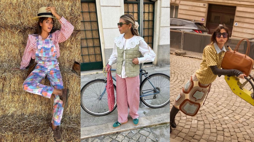
And somehow, Portuguese women keep coming to mind. For years now, they have been the undisputed icons of joyful print mixing.
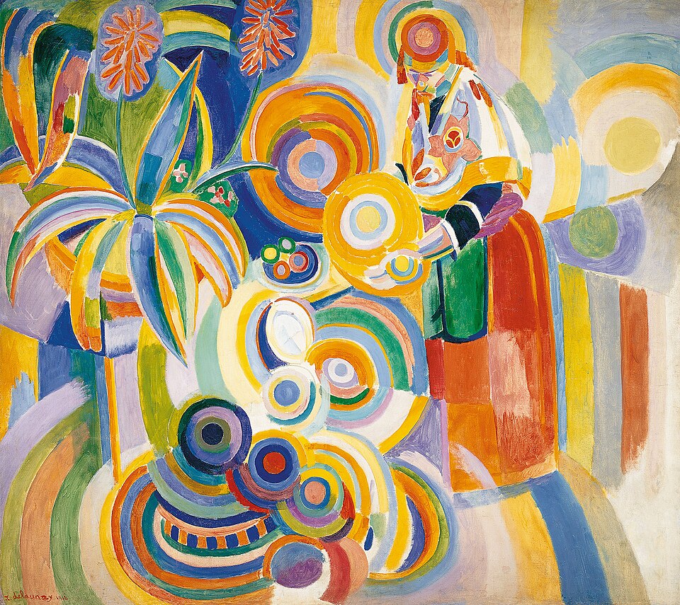
by Robert Delaunay
There is something about the way they dress that makes us vibrate instantly. That feeling of “I am not taking myself too seriously and yes, this outfit might look a little crazy”, when in reality everything is perfectly thought through. But what I love most is how they have taken the weight off fashion. How they have given it back its charisma, its freedom, and that simple yet powerful ability to make us feel alive. They take fashion less seriously, and by doing so, they make it infinitely more powerful.
And no, this is not about dressing like them, we each have our own language. It is about integrating a little of that joy into our own way of dressing, in a time when fear and uncertainty are part of everyday life. Because when fashion becomes lighter, it also becomes more curious. And behind those beautiful prints lie fascinating stories that, without us even realising it, can resonate with us and help us choose our next partner in crime, or as said in Portuguese our “companheiro de malandrices”.
Prints were born as a language. Long before writing. In Ghana, for example, each print and colour combination communicates status, moral values, or important moments in life. A true system of social reading. Something that also existed in Europe long before modern fashion. Today we wear damasks purely for pleasure, when for centuries doing so without a title would have been socially forbidden.
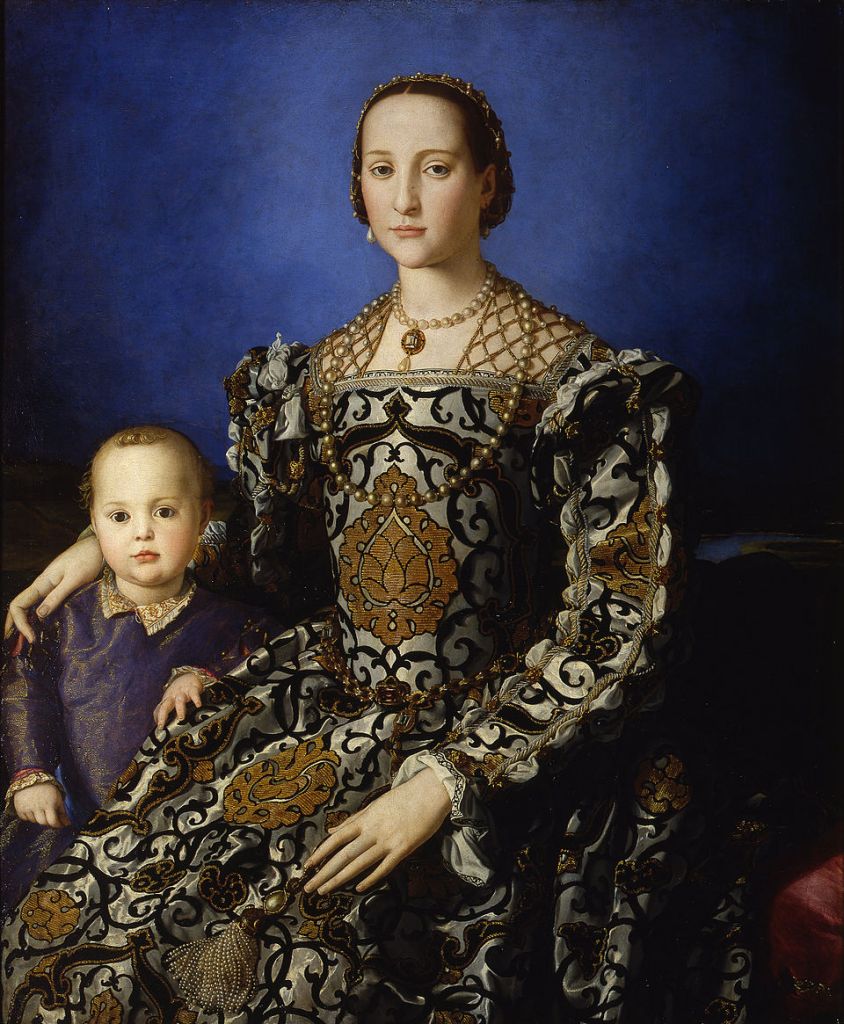
by Agnolo di Cosimo

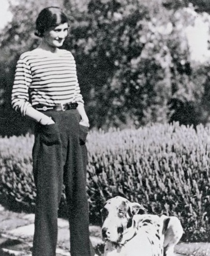
In Central Asia and the Middle East, geometric motifs carried spiritual and protective meanings. And closer to home, in France for instance, Breton stripes were designed so sailors could be easily spotted if they fell into the sea. Stripes could quite literally save your life, my friend. A practical, almost anonymous code, until Chanel took them out of uniform and turned them into an unmistakable symbol of French style.

Tartan once spoke of belonging, then of rebellion, and later of heritage. Florals have been with us for so long that we sometimes forget their strength. And polka dots, which for a long time made people uneasy because they evoked illness and death, eventually became synonymous with dance, rhythm, and life.
Modern fashion, much like Chanel did in her time, has gradually reclaimed these prints. It has freed them from their original rules, allowing us to mix them, play with them, and give them a life that would have been impossible back then. Turning them, at least for me, into symbols of freedom, expression, and creativity.
Today we live surrounded by caution. Everything seems to ask for restraint. Calm palettes. Safe silhouettes. Wardrobes designed not to stand out. Not for lack of taste, but for excess of control. Getting dressed has, in many cases, become a form of protection.
And I cannot help but wonder why we do not stop protecting ourselves quite so much and start living a little more.
Of course, I am not saying that these more controlled looks are not incredibly beautiful in their precision. And yet, perhaps it is time to bring prints back to life, the ones we so often leave aside. Even more so in winter, when we all fall into that slightly depressing black uniform, lovingly referred to as The Uniform by my dear friend María.
Prints do not change. History proves that.
What changes is the moment in which they resurface.
So what is stopping us from adding a few of them to our wardrobe foundations? Maybe it is time to look at them with fresh eyes and ask ourselves which of those incredible designs would make our inner child smile.
Learning to Play with Prints
Now, let us move on to the practical part. A few little tricks to start integrating prints into your wardrobe, or to take them one step further.
1. One print leads
Theory: the eye needs a clear focal point. Just like in life, two protagonists create confusion.
Practice: start with one main print and let the other support it.
2. Share at least one colour
Theory: the brain recognises colour before pattern and uses it to connect.
Practice: look for a colour in common, even if it is subtle.
3. Every print has a role
Theory: regular patterns organise the gaze and allow more freedom around them.
Practice: even when both prints are small, let one hold the look and the other animate it. Fine stripes, small checks, or vichy can almost work as neutrals.
4. Simplify the rest
Theory: the eye needs moments of calm to truly enjoy contrast.
Practice: reduce accessories and keep shoes simple.
Final rule
If it feels fun and effortless, it usually works.
If you feel disguised, there is too much information.
So go on. I invite you to try. To play. To laugh a little at yourself. To take things less seriously and enjoy the process more. Sometimes it is easier to dare impossible combinations than to let go of something that no longer represents us.
Who knows. After a few impossible outfits, you might feel ready to shake things up elsewhere too.
This article is dedicated to our inner child.
Let us play again.
Note: For the sake of simplicity, I have used the word ‘print’ to refer to both prints and patterns throughout this article.

Leave a comment